


Åben
FALL 2024 | ROLES: BRANDING, ILLUSTRATION, MOTION DESIGN
Smørrebrød Restaurant in Copenhagen, Denmark
THE BRIEF
Design a unique concept for a smørrebrød restaurant, including the theme, menu, and overall dining experience. The concept should balance traditional Danish elements with innovative ideas, emphasizing what makes it distinctive.
THE CONCEPT
Åben combines the Danish tradition of smørrebrød with a modern, customizable approach. Guests can start with a base of fresh rye bread and choose from a wide selection of proteins, vegetables, and toppings to create their own unique open-faced sandwich. The menu also features classic smørrebrød for those who prefer traditional combinations.
THE PROCESS
First, I began by immersing myself in both the history of smørrebrød and the aesthetics of Scandinavian cafés. I studied ingredient pairings, Danish food culture, and modern food service trends to imagine how a traditional meal could be adapted to a customizable model without losing its roots.


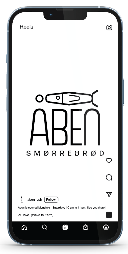
The name Åben (open in Danish) was chosen for its simplicity and layered meaning. Not only does it refer to the open-faced sandwich style, but it also speaks to transparency, flexibility, and the brand’s welcoming energy. The visual identity plays with clean typography, simple Scandinavian colors, and a fish illustration taken straight from the Å to appeal to younger diners.
SOCIAL MEDIA ANIMATION
To advertise my restaurant on social media, I created an animation on After Effects. It is meant to show that Åben is a welcoming and safe place for any fish in the sea; no matter how you like your smørrebrød. This can be used for public advertisements as well, such as billboards in the metro.
PACKAGING AND ADVERTISEMENTS

